KWGT Kustom Widget Maker
- 3.9
- Rating
- 10.00M
- Installs
- Free
- Price

 Analysis by App-foxy
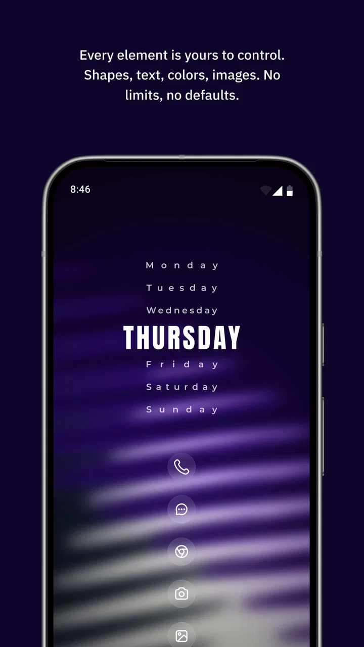
I have spent time with KWGT Kustom Widget Maker, and my first impression is that it is less a collection of ready-made widgets and more a small design studio for your Android home screen. It belongs to the personalization category, but that label only tells part of the story. You can build clocks, weather panels, activity displays, step counters, sleep-focused layouts, and much more, then arrange them to match the way you actually use your phone.
That freedom is the reason I keep coming back to it, but it is also the reason I would not recommend it blindly. A person who wants to pick a polished widget, place it, and forget about it may find the editor unnecessarily deep. Someone who enjoys adjusting spacing, typography, colors, and live information can get far more from it than from the usual fixed widget packs. In my experience, the key question is not whether it looks attractive. It is whether you want to make decisions about how your information is presented.
Where KWGT stands today
The app is made by Kustom Industries and is available as a free personalization app for users aged Everyone. It supports Android 8.0 and newer, which makes it accessible on a wide range of phones, although the exact experience still depends on the launcher, screen size, and the way a particular device handles background updates. Its current version is 3.81b530915, so this is a mature tool rather than a brand-new experiment.
You May Also Like

 Blood Strike: 2.5 Anniversary
Blood Strike’s Loadouts Turn Every Drop Into a Tactical Gamble
A close look at Blood Strike’s custom loadouts: how fast access to signature weapons reshapes its battle royale rhythm, rewards preparation, and narrows the gap between fights.

 Pandora - Music & Podcasts
Pandora’s Music Is Easy to Start, but Harder to Recover
Pandora’s strength is its low-effort path from a seed to a station. Its weak spot is how much confidence it asks you to place in connection, setup, and quiet recovery.

 8 Ball Pool
 Is Built on Rivalries, Rematches, and Routine
A close look at the rivalries, rematches, shared routines, and unanswered safety questions that turn a quick pool match into a persistent mobile community.

 Samsung Music
’s Quiet Strength Is Playing What You Already Own
Its reach comes less from spectacle than from dependable access to a personal library. That simplicity is both the app’s strongest retention engine and its ceiling.

 AccuWeather: Weather Radar
AccuWeather Review: A Quick, Clear Forecast for Everyday Decisions
For everyday plans, the best forecast is the one you can understand quickly. AccuWeather makes rain timing, radar, and local conditions easy to act on, with a few trade-offs.

 Hill Climb Racing
Why Hill Climb Racing Still Turns Crashes Into One More Run
A tiny car, a bumpy hill and one more upgrade: Hill Climb Racing keeps resurfacing because its simple chaos makes every near-miss feel personal.
More From Our News Desk



Its reach is substantial: the app has passed ten million installs, with an average rating of 3.9 from around forty-nine thousand ratings and roughly two thousand three hundred written reviews. I read that combination as a useful warning against oversimplifying it. Many people clearly find value in the editor, while the rating also suggests that the learning curve, device differences, or occasional setup friction can matter just as much as the visual results.
The free download is enough to explore the concept and create a meaningful setup. In-app purchases are listed at $6.99 per item, so I would treat the free version as a way to decide whether the workflow suits you before spending anything. That is especially important here because the main investment is not only money. It is attention. Building a widget can be quick, but building one that feels balanced and remains useful takes patience.
What makes the editor different
Most standard Android widgets are designed around a fixed purpose. A weather widget gives you weather, a clock widget gives you time, and a calendar widget gives you appointments. KWGT changes the relationship between the widget and the information. You start with a canvas and decide what belongs there, how it should look, and how it should react to changing values.
I found the layering approach particularly useful. Instead of treating a widget as one indivisible block, I could think in parts: a background shape, a text element, an icon, a progress-style visual, and a touch action. That makes it possible to create a compact panel that feels designed for a specific routine rather than copied from a general-purpose template.
The editor also rewards people who notice small inconsistencies. A clock can be visually centered even when its digits change. A weather line can be given enough room for longer conditions instead of looking fine only on a sunny day. A step display can be placed where it is visible without turning the entire home screen into a fitness dashboard. These are small choices, but they are where the app becomes more than decoration.
How I would use it in everyday life
Imagine starting the day with a single home-screen panel. The upper area shows the time in a large, calm typeface. Beneath it, a smaller line gives the current weather, while a lower section keeps activity information available without opening another app. I would leave the rest of the screen for the applications I use most. That arrangement reduces the need to swipe through pages just to answer simple questions.
Later, I might create a second layout for work. It could place the date, a compact clock, and a shortcut area closer to the thumb position. In the evening, a sleep-oriented arrangement could make the screen quieter, using less visual noise and keeping only the information I want to see before bed. The important point is not that every user needs three layouts. It is that the app lets the home screen follow different parts of the day.
There is a practical trade-off here. A widget that shows everything can become crowded and slow to understand at a glance. I recommend choosing one primary purpose first, then adding only the information that genuinely saves a tap. If the widget needs several seconds of reading, it has probably become a dashboard rather than a useful shortcut.
Three techniques that improve the result
My first tip is to design around the smallest realistic space, not the largest one available. A layout that looks impressive across a wide row may become awkward when resized or moved to another launcher grid. I start with the essential text and spacing, then add decoration only after the basic arrangement survives resizing. This approach also makes the widget easier to maintain when I change wallpaper or icon style.
My second tip is to separate information from visual framing. I use one layer for the background and other layers for content, rather than baking every detail into one elaborate arrangement. That makes color changes much faster and lets me reuse the same structure for a different purpose. It also helps diagnose problems: if the information is correct but hard to read, I can adjust the framing without rebuilding the data elements.
My third tip is to test changing content instead of judging a widget from one moment. Weather descriptions vary in length, numbers grow, and time formats can produce different spacing. I deliberately check the design at different times and with longer labels. This is one of the less obvious strengths of a configurable widget maker: it encourages you to design for states, not just for a screenshot.
I also pay attention to touch areas. A beautifully minimal panel is frustrating if its controls are too small or placed too close together. I prefer one or two clearly defined actions over a row of tiny invisible targets. The home screen is often used while walking, carrying something, or moving quickly, so visual elegance should not come at the expense of reliable tapping.
What the current version means for existing users
The current version, 3.81b530915, is the most useful concrete reference point for someone deciding whether to install today. It shows that the product is still being distributed in a current build rather than sitting unchanged as an abandoned customization tool. That does not guarantee that every phone will behave identically, but it is reassuring for people who want to build a setup they can keep using.
For an existing user, the sensible approach is to treat an update as part of a design workflow rather than assuming that every personal layout will look exactly the same afterward. Before changing a setup that took a long time to make, I would note the key arrangement, keep a simple backup habit where possible, and check the widget after updating the launcher or changing screen density. The risk is not necessarily a dramatic failure; small shifts in sizing or spacing can be enough to make a carefully balanced panel feel wrong.
New users should resist downloading several widget packs before understanding the editor. A ready-made design can be a helpful starting point, but importing many styles at once makes it harder to learn which part controls what. I get better results by choosing one visual direction, examining how it is built, and changing one element at a time. That turns the app from a source of endless templates into a tool I can actually control.
Where the learning curve becomes real
The biggest limitation is discoverability. The app can do a lot, but the path from “I want a clean clock” to “I know exactly which setting fixes this alignment” is not always obvious. I often need to think in terms of layers, formulas, sizing, and positioning rather than ordinary widget settings. That is satisfying once understood, but it can feel like work when all I wanted was a small clock.
Another friction point is consistency across phones. Android launchers do not all provide the same grid behavior, and manufacturers can handle home-screen refreshes differently. A design that fits neatly on one device may need adjustment on another. I would not create a complicated layout assuming it will transfer perfectly between phones without testing it.
There is also a maintenance cost. A fixed widget usually asks very little from me after setup. A custom KWGT design asks me to revisit it when my wallpaper changes, when I want a new color scheme, or when the information no longer matches my routine. For some people that is the fun part. For others, it is precisely the kind of tinkering they hoped to avoid.
I would also be cautious about overloading a single widget with live information. A compact design can become visually busy, and the more elements it contains, the more opportunities there are for awkward spacing or unclear priority. My best layouts have one obvious answer at a glance and treat everything else as secondary.
Who should install it, and who should skip it
I think it is a strong choice for Android users who care about a distinctive home screen, enjoy visual organization, or want one custom panel to combine information that normally lives in separate widgets. It is especially appealing if you have already tried standard widgets and found them either too plain, too large, or too rigid.
It is less suitable for someone who wants an effortless setup, dislikes adjusting visual details, or expects a widget to behave identically on every launcher. If your priority is a polished design with almost no configuration, a dedicated clock, weather, or calendar widget may be better. Those alternatives usually offer fewer creative choices, but that limitation is also what makes them quicker to use.
I would also skip it if the home screen is already working well and you have no interest in changing it. Customization apps are not automatically improvements. A clean default arrangement can be more practical than a complicated custom one, especially when you need dependable access to applications rather than a carefully composed information panel.
What I would watch next
When I look at an app like this, I watch for improvements that reduce friction without taking away creative control. The most valuable progress would be clearer guidance inside the editor, smoother handling of different screen sizes, and dependable behavior when a layout is moved between devices. Those changes would help beginners while preserving the depth that attracts experienced users.
I would also pay attention to how well existing designs age. A widget maker earns trust when a layout built months ago remains understandable and editable after updates. For current users, that matters more than a flashy new option. The best evolution would make advanced work easier to maintain, not simply add more controls to an already dense editor.
My final view is positive, with a clear qualification: KWGT Kustom Widget Maker is best understood as a design tool, not a one-tap widget catalog. It gives me the ability to build a home screen around my habits, and the results can be far more personal than standard alternatives. The free entry point makes it reasonable to try, while the optional $6.99 purchases mean I can decide later whether the deeper experience is worth paying for.
After using it, I would recommend starting with one small, useful widget rather than attempting a complete home-screen makeover. Build a readable clock or a compact daily panel, test it at different times, resize it, and live with it for a few days. If that process feels rewarding, the app has plenty of room to grow with you. If it feels like needless fiddling, a simpler widget will probably serve you better.
FAQs for KWGT Kustom Widget Maker
01What is KWGT Kustom Widget Maker?
KWGT Kustom Widget Maker is a powerful app that allows users to create customized widgets for their Android home screens. It offers a wide range of design tools, templates, and options to personalize widgets according to your preferences. With its intuitive interface, users can design widgets that display information like weather, time, battery level, and more.
02Is KWGT Kustom Widget Maker free to use?
KWGT offers a free version with basic features, allowing users to create and customize simple widgets. However, for access to more advanced features, including premium templates and components, users can purchase the KWGT Pro Key. The Pro version enhances the app's capabilities, providing a richer customization experience.
03Do I need any design skills to use KWGT?
While having design skills can be beneficial, they are not necessary to enjoy KWGT. The app provides an array of ready-to-use templates and a user-friendly interface that makes it easy for beginners to create beautiful widgets. Users can start with templates and gradually explore more complex customization options as they become comfortable.
04Can I integrate KWGT with other apps?
Yes, KWGT allows for seamless integration with various apps, enabling users to display data from other applications on their widgets. This includes information like music controls, weather updates, and calendar events. The versatility of KWGT ensures that your widgets can be both functional and aesthetically pleasing.
05Is KWGT available on iOS devices?
Unfortunately, KWGT Kustom Widget Maker is currently only available for Android devices. iOS users looking for similar customization options might need to explore other apps within the Apple ecosystem. Android users, however, can enjoy the full extent of KWGT's powerful widget-making capabilities.
Pros
- Highly customizable widgets
- User-friendly interface
- Wide range of templates
- Supports various data sources
- Active community support
Cons
- Steep learning curve
- Some features require Pro version
- Occasional bugs
- Limited free templates
- Battery consumption concerns

KWGT Kustom Widget Maker
Gallery